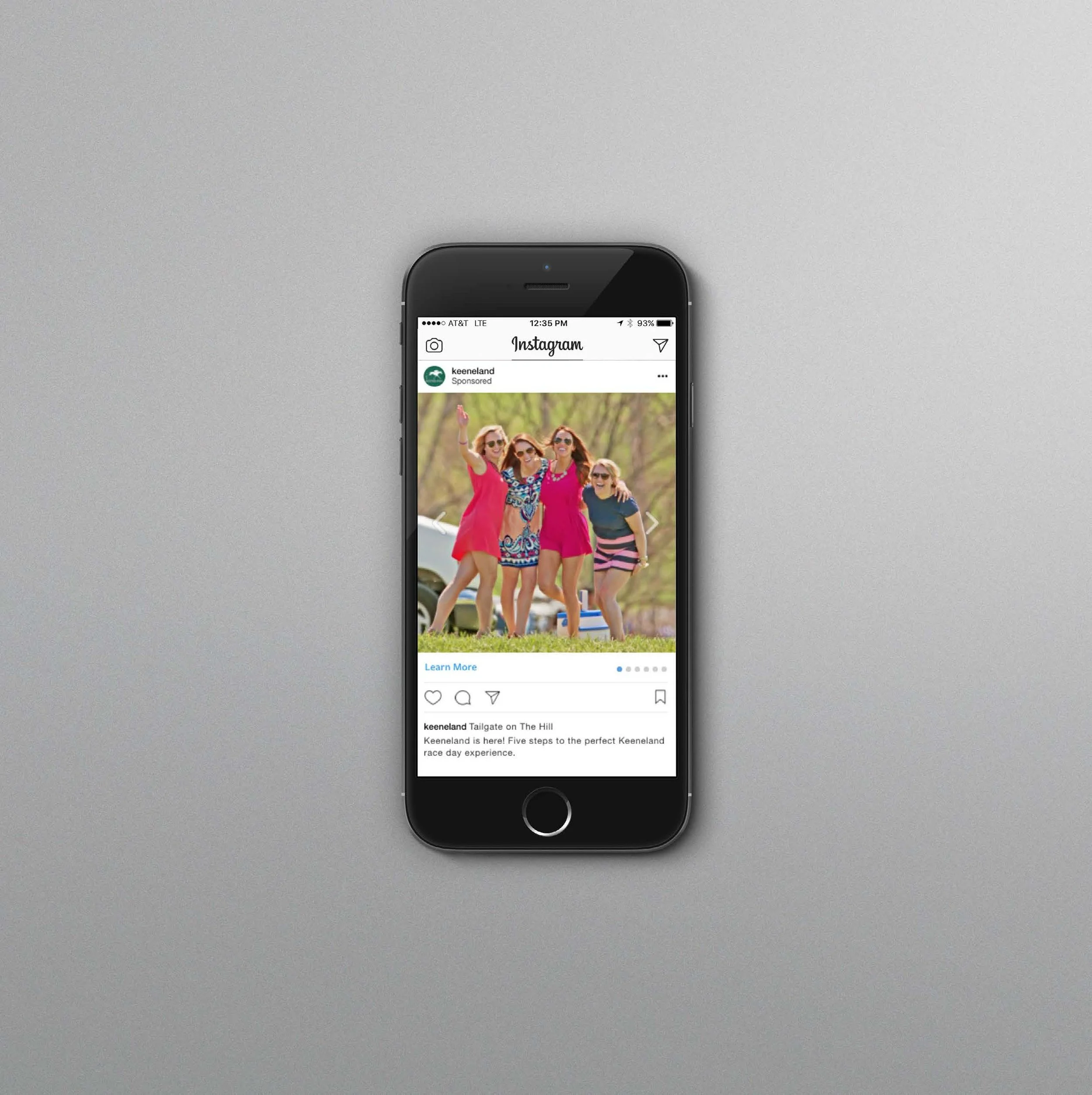
Tourism Campaign Before and After
BEFORE: Each Spring and Fall, race meeting posters and OOH were themed based on seasonal color schemes utilizing script type, emphasizing decorative flourishes .
AFTER
Posters and OOH are reimagined to emphasize action and excitement for casual fans. Extra bold slab- or sans-serif typography is used in vibrant, electrifying colors and eye-catching shapes in relationship to the dynamic, action-oriented compositions of the HDR toned racing imagery.
Each race season, that year’s themed posters are displayed throughout the city and sold on premise for autographs with the jockeys. Most of the posted posters are swiped by fans and wind up in dorm rooms or frames before the races even begin. (Theft, in this case, is the sincerest form of flattery.)
Marketing: OOH, Video, Audio, Social, Native
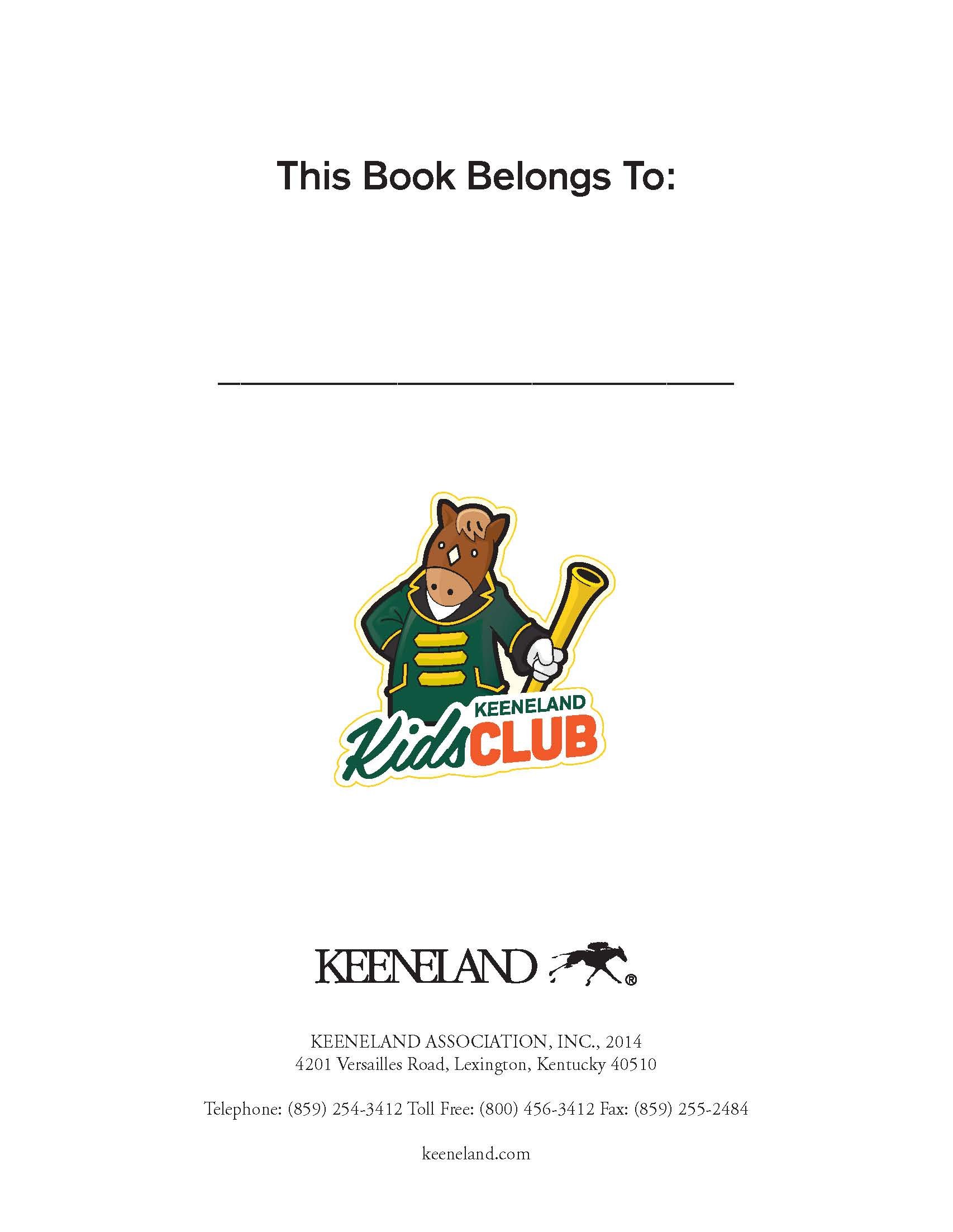
Mascot “Buckles”: The mascot’s name is a tribute to the track’s bugler, Bucky, a beloved local fixture at each meet. A mascot company and illustrator brought this fan activation to life. I designed accompanying badges, postcards, and ad collateral.


