Social Media Before and After
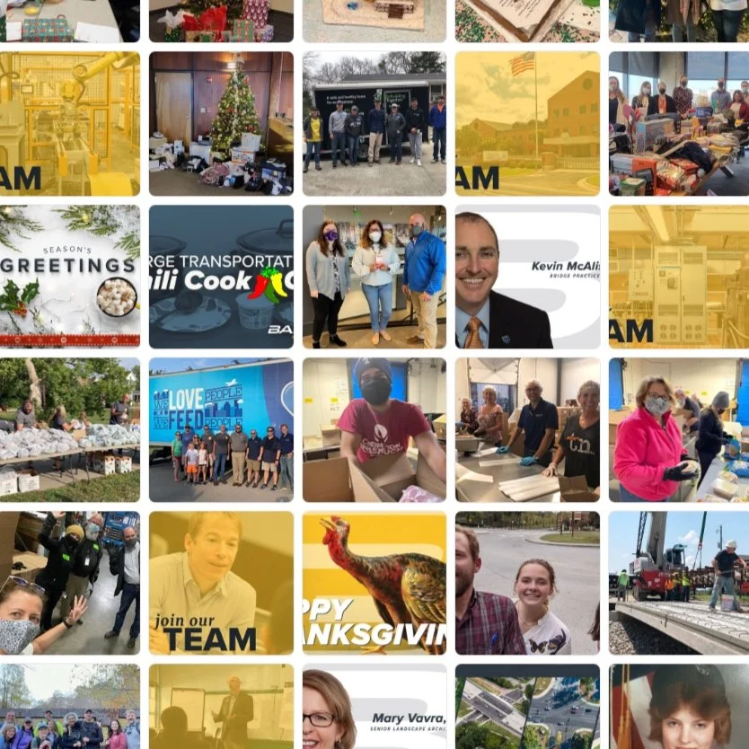
BEFORE: Navy blue and gold were typically paired with corporate headshot cutouts and news updates. Yellow overlays were frequently used.
AFTER
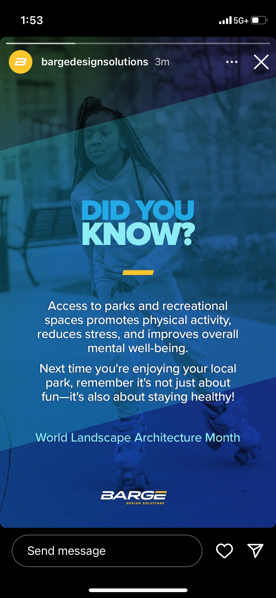
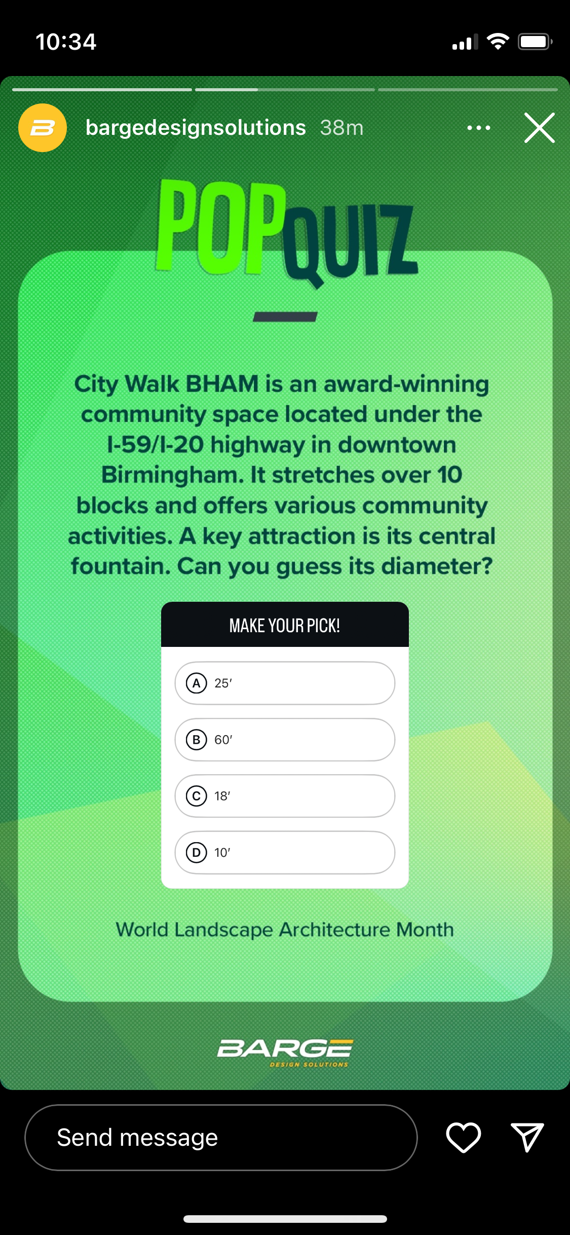
With brand yellow now reserved for feature elements and removed from text and background elements, there was room to expand use of secondary brand colors while humanizing the overall brand for a modernized, more engaging experience.
The existing CMYK color palette was revisited in HSB for more vivid, digital-friendly hues. For each brand hue, incrementally darker shades and lighter tints, along with textures, provided for flexible use as image overlays. The implementation of a grid system anchored brand elements and gave structure to a clearer type hierarchy.
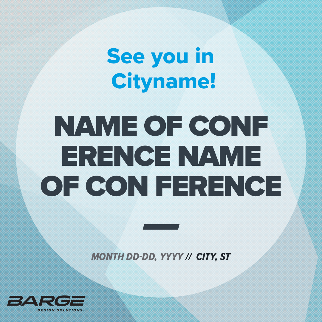
Cover images follow the parent color, pattern, and brand element system in more muted brand tints. Angled shapes are a nod to the 15-degree angle of the logo. They form an arrow shape directing attention to the brand name.
Just for Fun: Celebrations of the brand’s signature yellow encouraged teams to show off their colors.

