Rebranding Before and After
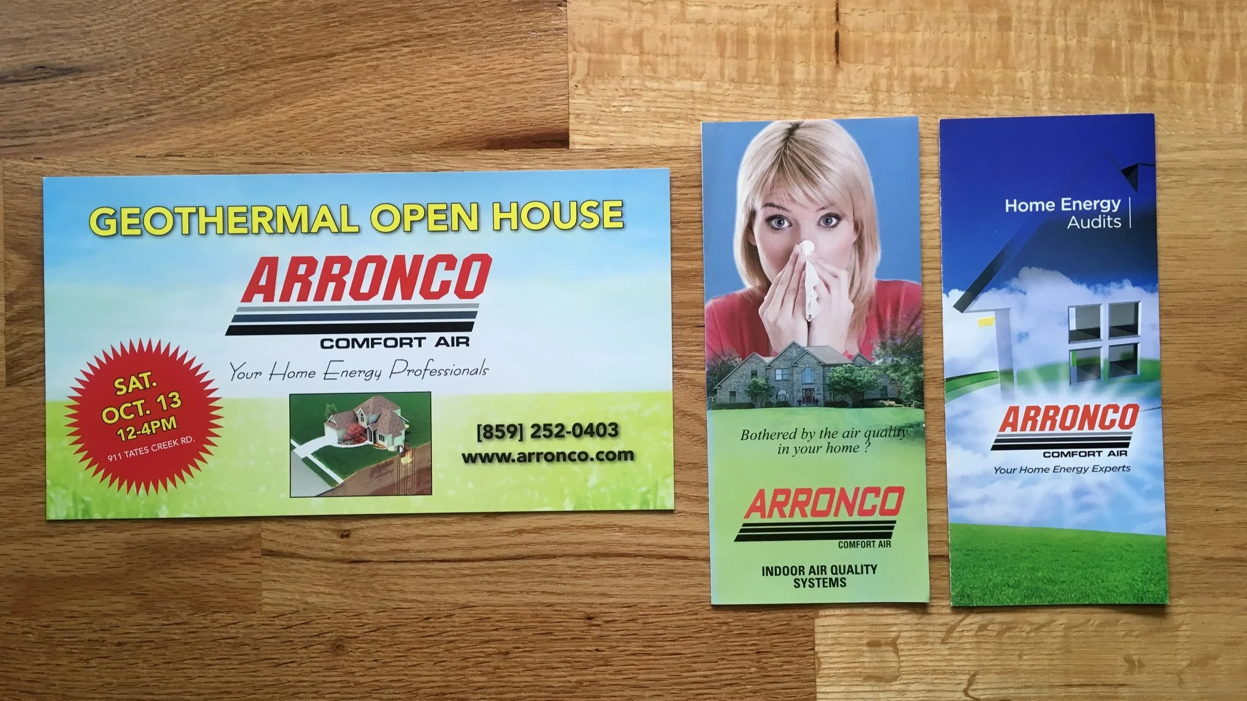
BEFORE: Positioned as a cost-saving and emergency service provider, the client’s all caps italic red and black logo with underlines had a heavy, industrial look. Messaging was often supported with stock imagery.
AFTER:
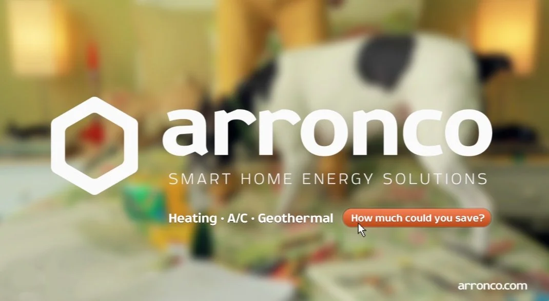
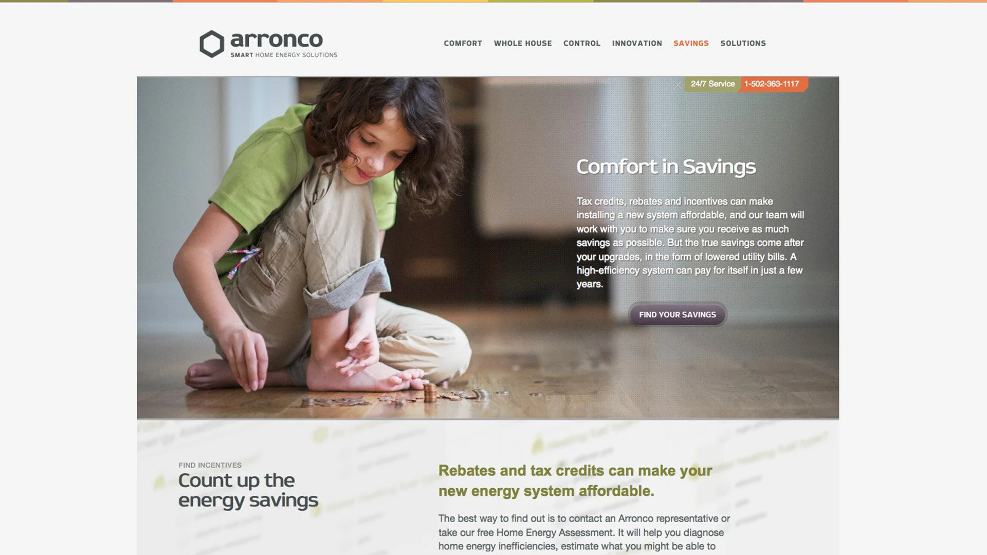
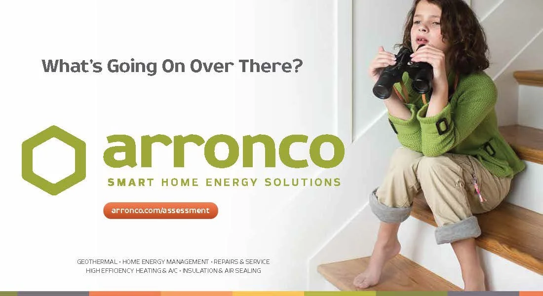
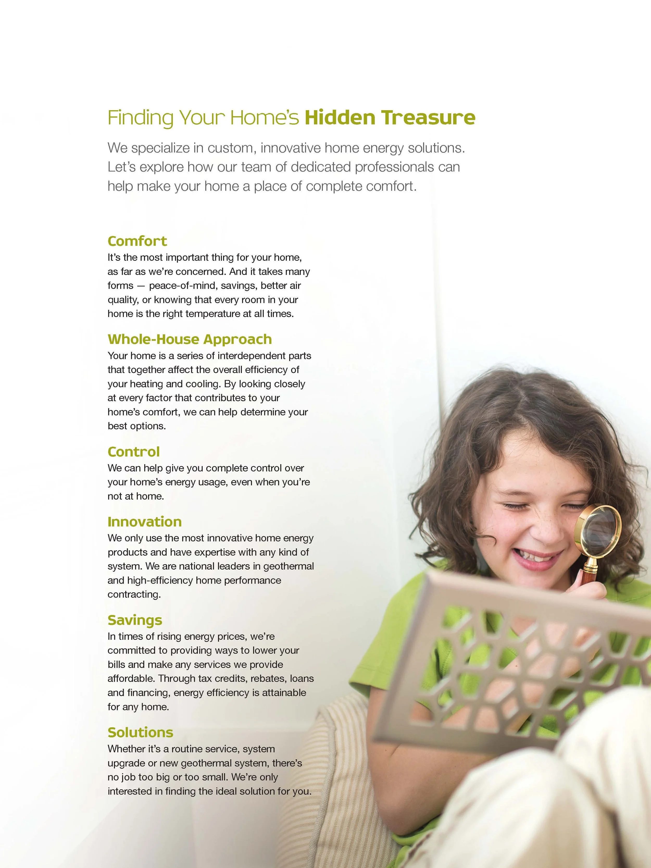
Repositioned as a smart solution for consistent comfort, the client’s new look included a softened, rounded logo and warming/cooling colors emphasizing year-round comfort. New feature custom photography was styled to the new aesthetic and supported the launch campaign’s message: Get Curious About Your Home’s Comfort.
Launching the new look…
Website
Direct Mail, Print Collateral
Ad Campaign (Print, Targeted)
Trade Show Banners, Yard Signs, OOH, Vehicle Wraps


