Digital Brand Identity and Launch
Many people aren’t prepared for retirement, making an otherwise achievable dream a major source of consumer confusion and stress.
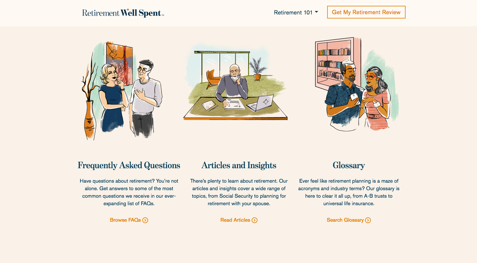
For this digital brand and its accompanying launch campaign, the identity balanced a simple, jargon-free voice with a breezy, comfortable UX and an illustrated, editorial feel. The end result is a modernized, nostalgic aesthetic true to the brand’s key message: Retirement shouldn’t feel like work.
Creative Direction: Inspiration for the brand’s color palette and illustration style came from midcentury home and lifestyle trends. Exterior house paint colors and the look and feel of 1960’s character illustration were combined and modernized thanks to an extraordinarily talented team, who combined their illustration, design, front end development, and copywriting skills in fresh and inspiring ways.
BRAND GUIDE
WEBSITE


